


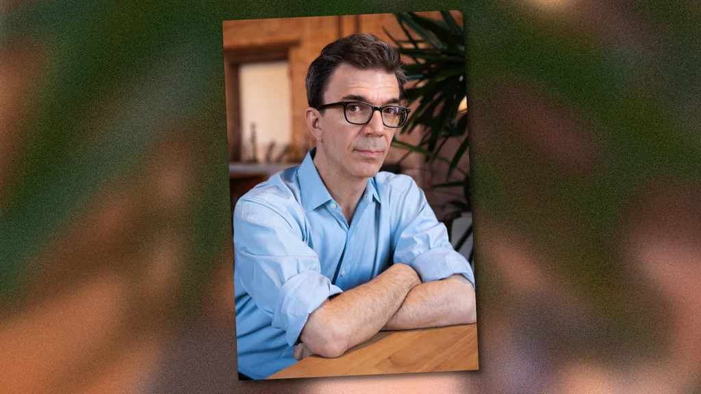
Tobias Frere-Jones has designed typefaces for clients like Martha Stewart Living, the New York City Metropolitan Transportation Authority, Carnegie Hall, Stacey Abrams, Barack Obama’s 2008 campaign, Zohran Mamdani’s mayoral office, the American Civil Liberties Union, New York City Football Club, and many more. Years ago, a friend of his asked him what he thought what letters are made of. Frere-Jones’s answer came quickly and in a single word: negotiation.
As a culture, we agree that letters take a certain shape and carry specific meaning, says Frere-Jones. Running his own typeface foundry in Brooklyn, he describes himself a translator, oscillating between a client’s idea of what their brand or project communicates and his own understanding of the shapes that make letters and what any given design of those shapes communicates to the people looking at it.
Says Frere-Jones: “An important part of my process is to be able to either alternate between two modes—engineer or artist—or hold them in my head simultaneously so they can collaborate with one another.”
The shortest version of my story is that I am a writer who wanted to be a painter. That’s how I came to this. The slightly longer version is that through high school, I was pursuing every kind of visual art I could get my hands onto: drawing and painting and photography. I also enjoyed writing. My brother, father, and great-grandfather were all writers. I came to settle on abstract painting. That’s where I thought I’d want to go. I thought I’d have to choose one and abandon the others. I discovered by accident through my father’s work in advertising that there was this thing called typeface design. I realized it was an intersection of working with abstract expressive form and language at the same time. I wasn’t even looking for it because I didn’t think it was possible.
In 1992, no one was teaching this. I realized that I was not going to learn what I wanted to learn in school. At the time, typeface was too specialized to include in most design school curriculums. That has since changed. My first job was a junior designer at the Font Bureau in Boston. I was going to learn on the job, which is how designers centuries before me also learned. I was most acutely aware of all of the things I didn’t know. I was trying to soak up everything the designer I worked for gave me—a guy by the name of David Berlow.
There are two schools of thought on how designers position themselves in the world. One is that they are engineers; they are solving problems and maximizing results and all of the vocabulary that comes through that more practical viewpoint. The other is that they are half a step removed from being an artist; they bring intuition and expression that can be this necessary color and animating force in what they provide for their clients. Both are true. An important part of my process is to be able to either alternate between these two modes—engineer or artist—or hold them in my head simultaneously so they can collaborate with one another. That kind of crossover is an important part of how I work.
The two fields that I turn to most frequently are music and history. In a very amateur way, I play keyboard and synthesizer and make sound audio collages. I think that has a lot of overlap in typeface design and in programming—which is something that’s very close to typeface design. It’s really a very narrow palette of elements. There are only 12 notes, really, in Western music. Everything is a variant or a combination after that. The other place where I give my attention is history. I’m particularly interested in the history of New York. It’s my hometown, and it’s all around me. It feels parallel in the same way that the alphabet is this set of shapes that have meaning because we all agree they have meaning. The city and its streets have a similar aspect in being developed, handed down, and modified, and interpreted and handed down again, resting critically on consensus as to how this space works and what it’s for.